Color psychology is a fascinating field that delves into how colors influence human emotions, perceptions, and behaviors. In the realm of marketing and branding, understanding color psychology is not just an academic exercise; it’s a strategic imperative. The colors you choose for your brand can evoke specific feelings, shape consumer perceptions, and ultimately drive purchasing decisions.
As CMOs and founders, recognizing the psychological impact of color can provide a competitive edge in a crowded marketplace. In an age where consumers are bombarded with choices, the right color palette can differentiate your brand and create a lasting impression. This article will explore the intricate relationship between color and consumer behavior, the role of color in brand identity, and how to effectively harness this knowledge to enhance your marketing strategies.
By the end, you’ll have actionable insights to leverage color psychology for your brand’s success.
Key Takeaways
- Color psychology plays a significant role in consumer behavior and brand identity.
- Emotional associations of colors vary across cultures and regions, impacting perception.
- Consistency in color usage is crucial for triggering brand recognition and conveying brand values.
- Creating a strategic color palette is essential for effective branding and marketing.
- Color can be used to communicate brand messages and values, harnessing its psychological power in marketing.
The Impact of Color on Consumer Behavior
Research shows that up to 90% of snap judgments made about products are based on color alone. This statistic underscores the profound impact color has on consumer behavior. For instance, a study by the University of Loyola found that color increases brand recognition by up to 80%.
When consumers encounter a product, their initial emotional response is often dictated by its color, which can lead to immediate attraction or aversion.
Brands like McDonald’s and Burger King utilize red and yellow in their logos and restaurant designs to stimulate hunger and create a sense of urgency.
These colors are not arbitrary; they are carefully chosen to elicit specific emotional responses that drive consumer behavior. Understanding these dynamics allows marketers to craft experiences that resonate with their target audience on a deeper level.
The Role of Color in Brand Identity
Color is a cornerstone of brand identity, serving as a visual shorthand for what a brand represents. It encapsulates the essence of a brand’s personality and values, making it instantly recognizable. For example, Tiffany & Co.’s signature robin’s egg blue is synonymous with luxury and exclusivity, while Coca-Cola’s vibrant red evokes feelings of excitement and happiness.
These colors are not just aesthetic choices; they are integral to the brand’s narrative. When developing a brand identity, it’s crucial to select colors that align with your brand’s mission and vision. A tech startup might opt for sleek blues and grays to convey innovation and reliability, while an eco-friendly brand may choose earthy greens and browns to reflect sustainability.
The right color palette can create an emotional connection with consumers, fostering loyalty and trust over time.
Understanding the Emotional Associations of Colors
Each color carries its own set of emotional associations that can significantly influence consumer perceptions. For instance, blue is often associated with trust and dependability, making it a popular choice for financial institutions like American Express and PayPal. In contrast, yellow is linked to optimism and cheerfulness, which is why brands like McDonald’s use it prominently in their marketing.
Understanding these associations allows marketers to strategically select colors that align with their desired messaging. For example, if a brand aims to promote relaxation and tranquility, shades of green or soft blues may be more effective than bold reds or oranges. By tapping into the emotional resonance of colors, brands can create more impactful marketing campaigns that speak directly to their audience’s feelings and aspirations.
Cultural and Regional Influences on Color Perception
Color perception is not universal; it varies significantly across cultures and regions. For instance, while white is often associated with purity and weddings in Western cultures, it symbolizes mourning in many Eastern cultures. This cultural context can dramatically affect how consumers respond to color in branding and marketing.
Marketers must be aware of these cultural nuances when developing global campaigns.
For example, when Coca-Cola launched its “Share a Coke” campaign in China, they had to consider local perceptions of red—often seen as auspicious—while ensuring that the overall message aligned with cultural values.
By conducting thorough research into regional color meanings, brands can avoid missteps and create campaigns that resonate authentically with diverse audiences.
The Use of Color in Marketing and Advertising
In marketing and advertising, color serves as a powerful tool for capturing attention and conveying messages quickly. Advertisements that utilize vibrant colors tend to stand out more in consumers’ minds, leading to higher engagement rates. For instance, studies have shown that ads featuring color can increase readership by 80% compared to black-and-white ads.
Moreover, the strategic use of color can guide consumer behavior within advertisements. For example, using contrasting colors can highlight calls-to-action (CTAs), making them more prominent and encouraging clicks or purchases. Brands like Amazon employ this tactic effectively by using bright orange buttons against a white background to draw attention to their “Buy Now” options.
By understanding how color influences attention and action, marketers can design more effective advertising strategies.
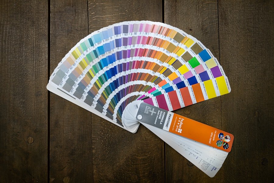
Creating a Color Palette for Branding
Developing a cohesive color palette is essential for establishing a strong brand identity. A well-defined palette not only enhances visual appeal but also ensures consistency across all marketing materials. When creating a color palette, consider the emotions you want to evoke and how those colors align with your brand values.
Start by selecting a primary color that embodies your brand’s essence. This will serve as the foundation for your palette. Next, choose complementary colors that enhance the primary hue without overwhelming it.
Tools like Adobe Color or Coolors can help you experiment with different combinations until you find the perfect fit. Remember, simplicity is key; too many colors can dilute your brand message and confuse consumers.
The Importance of Consistency in Color Usage
Consistency in color usage is paramount for building brand recognition and trust. When consumers encounter your brand across various platforms—be it social media, websites, or packaging—they should immediately recognize your color scheme. This consistency reinforces brand identity and fosters familiarity.
Take the example of Starbucks; their iconic green is instantly recognizable worldwide. By maintaining consistent use of this color across all touchpoints—from cups to storefronts—Starbucks has created a strong visual identity that resonates with consumers globally. To achieve this level of consistency, develop clear guidelines for color usage within your branding strategy, ensuring that all team members adhere to them.
The Power of Color in Triggering Brand Recognition
Color plays a crucial role in triggering brand recognition, often serving as the first point of contact between consumers and brands. Research indicates that people remember colors better than words or logos; thus, an effective color strategy can significantly enhance recall rates. Consider how brands like Target have successfully leveraged red as their signature color.
This bold choice not only makes their logo memorable but also creates an emotional connection with consumers who associate red with excitement and energy. By consistently using this color across all marketing channels, Target has ingrained itself into the minds of consumers as a go-to destination for affordable shopping.
Using Color to Communicate Brand Values and Messages
Colors can also be powerful communicators of brand values and messages. For instance, green is often associated with sustainability and health, making it an ideal choice for brands focused on eco-friendliness or wellness. Brands like Whole Foods have effectively used green in their branding to convey their commitment to organic products.
Moreover, colors can be used strategically to highlight specific messages within campaigns. For example, during Breast Cancer Awareness Month, many brands incorporate pink into their marketing materials to show support for the cause. This not only aligns their messaging with social responsibility but also resonates emotionally with consumers who value corporate social responsibility.
Harnessing the Psychological Power of Color in Marketing and Branding
In conclusion, understanding color psychology is essential for any marketer looking to create impactful branding strategies. From influencing consumer behavior to establishing brand identity and recognition, the power of color cannot be underestimated. By thoughtfully selecting colors that align with your brand values and resonate with your target audience, you can create compelling marketing campaigns that drive engagement and loyalty.
As you move forward in your branding journey, remember that every color choice carries weight—both emotionally and strategically. Embrace the psychological power of color as a tool for storytelling and connection in your marketing efforts. By doing so, you’ll not only enhance your brand’s visibility but also foster deeper relationships with your consumers—ultimately leading to greater success in today’s competitive landscape.
If you are interested in learning more about how data insights can impact marketing strategies, check out the article Marketing Analytics: Data Insights. This article delves into the importance of utilizing data to make informed decisions and optimize marketing campaigns. Understanding consumer behavior through data analysis can greatly enhance the effectiveness of color psychology in marketing and branding strategies.
FAQs
What is the psychology of color in marketing and branding?
The psychology of color in marketing and branding is the study of how different colors can impact consumer perceptions, emotions, and behaviors. It explores how color choices can influence brand recognition, purchase decisions, and overall brand identity.
How do different colors impact consumer perceptions?
Different colors can evoke different emotions and associations in consumers. For example, blue is often associated with trust and reliability, while red can evoke feelings of excitement and urgency. Understanding these associations can help marketers and brands choose colors that align with their desired brand image and messaging.
What are some common associations with specific colors?
Some common associations with specific colors include:
– Red: excitement, passion, urgency
– Blue: trust, reliability, calmness
– Green: nature, health, wealth
– Yellow: optimism, clarity, warmth
– Purple: luxury, creativity, wisdom
– Orange: energy, enthusiasm, creativity
– Black: sophistication, power, elegance
– White: purity, simplicity, cleanliness
How can brands use color psychology in their marketing and branding strategies?
Brands can use color psychology to evoke specific emotions and associations, create a strong brand identity, and differentiate themselves from competitors. This can be done through logo design, packaging, website design, and overall brand messaging.
Are there cultural differences in the interpretation of colors?
Yes, there are cultural differences in the interpretation of colors. Different cultures may have varying associations and meanings for specific colors, so it’s important for brands to consider cultural nuances when using color in their marketing and branding efforts.