Most businesses discover the problem the first time a printer asks for “a vector file” or a social platform crops their logo badly. The fix is simple: keep a complete, well-organised logo kit and know which file to reach for.
Vector and raster: the one distinction that matters
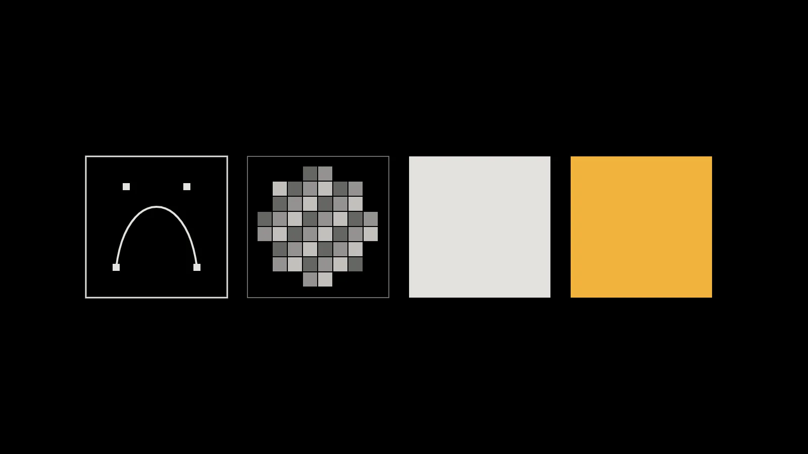
Every image format is one of two kinds. Vector files describe shapes mathematically, so they stay sharp at any size, from a favicon to a billboard. Raster files are grids of pixels, so they look soft or blocky when enlarged beyond their size. A logo should always start life as a vector, with raster versions exported from it.
Key takeaway
Your designer should hand over vector originals. If all you have is a small PNG, you don’t really have your logo.
The formats, and what each is for
| Format | Type | Best for | Watch out for |
|---|---|---|---|
| SVG | Vector | Websites and apps: sharp at every size, usually tiny files | Some social platforms and office tools don’t accept it |
| PDF / EPS | Vector | Print: signs, vehicles, merchandise, stationery | Make sure text is converted to outlines |
| PNG | Raster, lossless | Places that need an image file with a transparent background | Export at the size needed; enlarging blurs it |
| JPEG | Raster, lossy | Photographs | No transparency; compression blurs sharp edges, so avoid it for logos |
| WebP / AVIF | Raster, modern | Website photos and graphics at smaller file sizes | Use SVG for the logo itself where you can |
MDN’s guide to image formats puts it plainly: SVG is ideal for icons, diagrams and other images that must be drawn accurately at any size, while JPEG is best for photographs and can give unsatisfactory results on sharp-edged graphics. PNG offers lossless compression with full transparency, and JPEG doesn’t support transparency at all.
The versions every logo kit should include
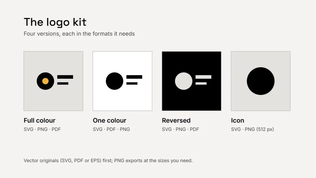
- Primary, full colour: the main version, on a light background.
- One colour: solid black (and often solid white), for engraving, embroidery, stamps and single-colour print.
- Reversed: for dark backgrounds, so you never place the dark logo on a dark photo.
- Compact or icon: a simplified mark for social profile pictures, app icons and favicons, where the full logo is too small to read.
- Horizontal and stacked layouts if your logo has a name and a symbol, so it fits both wide and tall spaces.
Colour for screen and print
Screens mix light (RGB), while most printing mixes ink (CMYK), and the same colour can look different in each. A good kit specifies your colours in each system: hex values for the web, CMYK for print, and, where colour accuracy really matters, a Pantone reference that printers can match. Keep separate files set up for screen and print rather than converting on the fly.
A logo is only as good as the file someone can find when they need it.
Keep it organised
- One shared folder, with subfolders for web, print and social.
- Clear file names, such as
brand-logo-reversed.svgorbrand-icon-512.png. - A one-page guide explaining clear space, minimum size and which version to use where.
- The original source files from your designer, stored safely, and a note of who owns the rights.
Checklist
- Vector originals first.
- SVG for the web; PDF or EPS for print; PNG where transparency is needed.
- Full colour, one colour, reversed and icon versions.
- Colours defined for screen and print.
- One organised, shared folder.
Our article on what a brand identity system includes covers the guidelines that sit around these files.
Related service
Logos and identity systems delivered as complete, organised kits.