Dark mode reverses the usual scheme: light text on dark backgrounds. On websites, visitors can tell their browser they prefer it, and well-built sites respond. MDN explains that the CSS feature prefers-color-scheme detects whether a person has asked for a light or dark theme. Here is what that means for your brand.
Start with the logo
A dark logo on a dark background disappears. That is why every logo kit should include a reversed version, light on dark, designed rather than simply inverted. Inverting colours automatically can turn a brand colour into something unrecognisable.
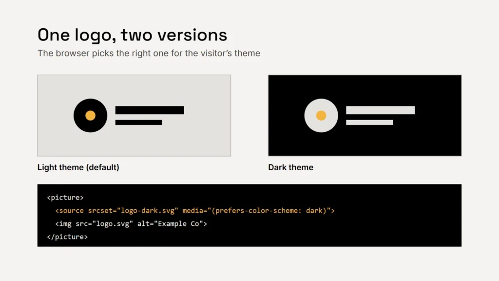
On a website, the HTML picture element can swap the logo automatically. MDN gives this exact use as an example: a dark-theme source with media="(prefers-color-scheme: dark)", and the normal logo as the default image. Keep the same alt text on both.
Key takeaway
Design a reversed logo on purpose, and test it on real dark screens, not just a black rectangle.
Colours: plan a dark palette
Your brand colours were probably chosen against white. On a dark background, the same colour may look different, and its contrast changes completely. Plan a small dark palette alongside your main one: the background, text, accent and border colours you’ll use when the screen is dark.
Check contrast in both modes
| What | Minimum contrast (WCAG 2.2) |
|---|---|
| Normal text | 4.5:1 |
| Large text (18pt, or 14pt bold) | 3:1 |
| Icons, buttons and form borders | 3:1 against adjacent colours |
| Text that is part of a logo | No contrast requirement |
One point catches brands out. WCAG exempts logos, but it says that, beyond logos, text with poor contrast because of brand guidelines is not exempt. If your brand colour fails against a dark background, use a lighter tint for text, or keep the colour for accents. Our article on accessible brand colours explains how contrast is measured.
Dark mode isn’t an inverted brand. It’s the same brand, lit differently.
Making your website respond
- Define colours as variables in your CSS, then give them dark values inside a
prefers-color-scheme: darkmedia query. - Set
color-scheme. MDN explains that this tells the browser which schemes a page supports, so it can style scrollbars and form controls to match. Acolor-schememeta tag in the page head can help prevent a flash of the wrong colours while the page loads. - Remember the default. MDN notes that the light value also matches when someone hasn’t expressed a preference, so light remains the fallback.
- Check images. Graphics with transparent backgrounds and dark lines can vanish on dark pages; give them a background or a light version.
Email and documents
Some email apps apply their own dark mode and change colours themselves, with results you can’t fully control. Use a logo with a transparent background and a light outline or reversed version that still reads if the background turns dark, and test your emails in several apps before sending to customers.
Checklist
- A designed reversed logo.
- A small dark palette.
- Contrast checked in both modes.
- Logo swapped with the picture element.
- CSS colour variables, color-scheme set.
- Emails tested in dark mode.