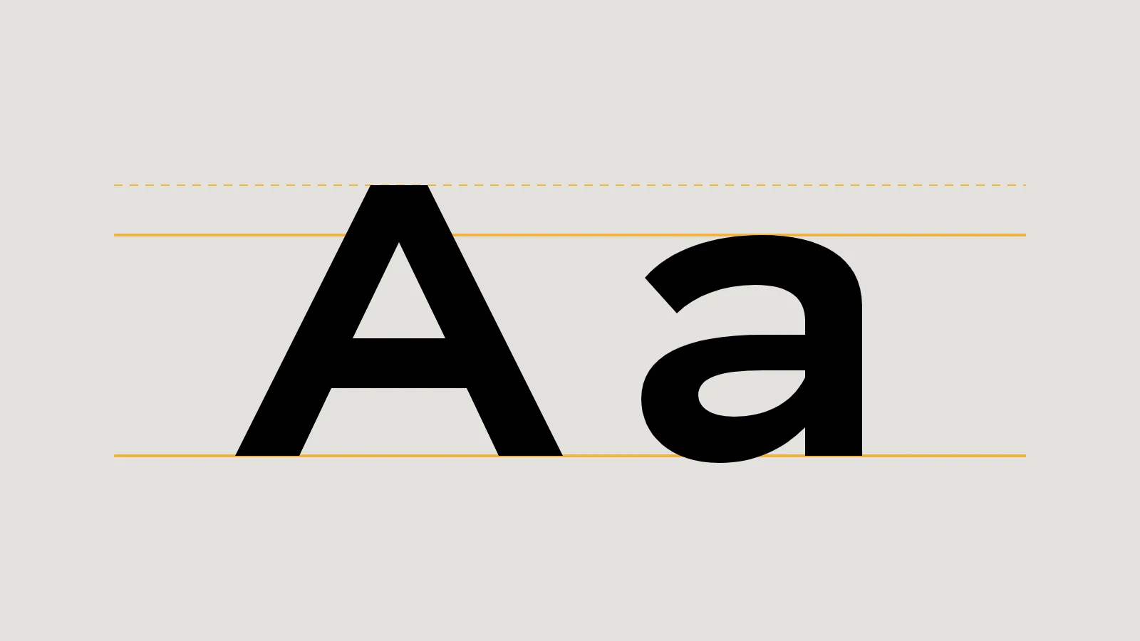
A brand usually needs two or three typefaces at most: one for headings, one for body text, and sometimes one for numbers or special uses. Choosing them is a design decision. Using them correctly is partly a legal one, because every font is software with a licence.
Choosing: a short brief
- Readability first. Body text must be comfortable at small sizes on phones. Save distinctive display faces for headings.
- Enough weights and characters. Check for bold and italic, figures that line up in tables, and any accented characters or languages you need.
- Pair by contrast. A characterful heading face with a quiet, neutral body face is a reliable combination. Two similar faces fight each other.
- Test with real content, such as your service names, prices and a long paragraph, not just the alphabet.
Licences: the part people skip
A font file is licensed, not owned. The licence decides where you can use it: installed on your computers, embedded in a website, built into an app, used in a logo, or printed on products. Free and paid fonts work very differently.
Open source fonts and the SIL Open Font License
Many free fonts use the SIL Open Font License (OFL). Its official text says it allows fonts to be used, studied, modified and redistributed freely as long as they are not sold by themselves. The OFL’s own site says you can use OFL fonts in books, posters, artwork, logos and on websites, with no acknowledgement required. Two conditions to know: you can’t sell the font files on their own, and a modified version can’t use the font’s reserved name without permission. Always check each font’s licence file, because not every free font uses the OFL.
Commercial fonts
Paid fonts each have their own licence agreement, and terms vary between foundries. Before buying, check the licence for each use you plan:
| Use | Question to check in the licence |
|---|---|
| Desktop | How many computers or users can install it? |
| Website | Is web embedding included, and is it limited by traffic? |
| App | Is embedding in a mobile or desktop app covered? |
| Logo | Can the font be used in a logo or trademark? |
| Products | Does printing on goods for sale need an extra licence? |
| Contractors | Can your designer or agency use your licence on your behalf? |
Key takeaway
Keep a record of every font your brand uses, where it came from, its licence and who holds it.
A font is software. Its licence decides where your brand can use it.
Fonts and website speed
Every web font is a file visitors must download before text can appear in that font. A few habits keep this quick:
- Use WOFF2. Google’s web.dev guide says WOFF2 compresses 30% better than WOFF.
- Use fewer fonts and weights. As web.dev puts it, the fastest font to deliver is one that isn’t requested at all. System fonts cost nothing to load.
- Consider variable fonts. MDN explains that a variable font holds many variations of a typeface, such as weights and widths, in a single file.
- Show text straight away. The CSS setting
font-display: swapshows text in a fallback font immediately and switches to the web font once it loads. - Self host where the licence allows. web.dev advises checking that the licence permits subsetting and self hosting first.
Font loading affects Core Web Vitals, especially layout shift when text changes font. Our guide to Core Web Vitals explains what those scores mean.
Put it in your brand guidelines
Record the fonts, the weights and sizes for each use, fallback fonts for email and documents, and where the licences are kept. Our articles on what a brand identity system includes and logo file formats cover the rest of the kit.
Checklist
- Two or three typefaces, chosen with real content.
- A licence checked for every planned use.
- A record of every font and its licence.
- WOFF2, few weights, font-display: swap.
- Fonts written into your brand guidelines.
Related service
Identity systems with typography chosen, licensed and documented.