A good contact form feels effortless: a few clear questions, a button, and a confirmation. Getting there is mostly about removing things. The W3C’s forms tutorial, written by the group behind the web’s accessibility standards, puts the first rule simply: only ask for what is needed, because irrelevant or excessive questions make people more likely to give up.
Ask for less
For a first enquiry, you usually need a name, a way to reply (email or phone) and a message. Perhaps one more question that helps you route or prepare: the service needed, or a postcode for a service-area business. Everything else can wait for the conversation.
Key takeaway
Every extra field costs you enquiries. Ask the rest when you reply.
The anatomy of a form that works
Visible labels on every field
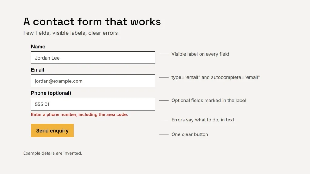
The W3C says to provide labels for all form controls, and notes that most users prefer, or even need, visible labels to understand a form. Placeholder text inside the box is not a replacement: it disappears as soon as someone types, and the W3C notes that screen readers don’t treat it as a label.
Say what is required
Mark required and optional fields clearly, in the label itself, for example “Phone (optional)”. Don’t rely on colour or an unexplained asterisk alone.
Help browsers fill it in
- Use the
autocompleteattribute with values such asname,email,telandpostal-code. MDN notes this helps people with cognitive and motor impairments, among others, fill in forms more quickly and accurately. - Use the right input type.
type="email"checks the address is properly formatted (not that it exists).type="tel"may show a phone keypad on mobile, though phone numbers aren’t format-checked because they vary so much around the world. - Don’t make people type their email twice. web.dev advises against doubling up inputs just to check contact details.
Errors that explain themselves
When something is wrong, WCAG requires that the field in error is identified and the error is described in text. The W3C recommends messages that are easy to understand and say how to fix the problem: “Enter a phone number, including the area code”, not “Invalid input”. Keep what the person already typed, so they don’t start again.
A form that rejects a real customer is worse than one that lets a little spam through.
Stopping spam without blocking people
Spam is a real nuisance, but the cure can be worse than the disease. The W3C’s note on CAPTCHA warns that CAPTCHAs often prevent people with disabilities from completing the task. It describes a gentler first line of defence, a honeypot: a field hidden from people but visible to bots, so a form that arrives with it filled in can be discarded. Its advice is to use a honeypot if that suffices, and to escalate only when there is evidence of attacks.
| Measure | Effect on real people | Use it |
|---|---|---|
| Honeypot field | None, when properly hidden | First |
| Server-side checks (links, repeated submissions, timing) | None | Alongside the honeypot |
| Rate limiting | Rarely noticed | If bots hammer the form |
| Puzzle CAPTCHA | Can block disabled and less technical users | Only as a last resort, with accessible alternatives |
The W3C also reminds developers that checks in the browser alone don’t make a form secure: data must be validated on the server too.
After the button
- Confirm clearly: a thank-you message or page that says what happens next and when.
- Send a copy to the person if you can, so they have a record.
- Test it monthly: send yourself an enquiry and check it arrives. Forms break quietly.
- Keep only what you need, and say in your privacy policy how long you keep enquiries.
If your thank-you page has its own address, you can count completed enquiries in your analytics. Our guide to counting enquiries in Google Analytics shows how. For the wider accessibility picture, see our guide to ADA and website accessibility.
Checklist
- Three or four fields for a first enquiry.
- A visible label on every field, with required fields marked.
- Autocomplete and the right input types.
- Errors that say how to fix them.
- A honeypot before any CAPTCHA.
- A monthly test enquiry.
Related service
Accessible enquiry forms built, tested and kept working.
Sources
- W3C WAI: Forms tutorial
- W3C WAI: Labeling controls
- W3C WAI: Form instructions
- W3C WAI: User notifications
- W3C WAI: Understanding Success Criterion 3.3.1 Error Identification
- W3C: Inaccessibility of CAPTCHA (Group Draft Note)
- MDN Web Docs: HTML attribute autocomplete
- MDN Web Docs: input type="tel"
- web.dev: Sign-up form best practices