Most plumbing websites are built for one kind of customer and lose the other. A site that only shouts “24/7 emergency” can feel thin to someone planning a whole-house repipe. A site full of long service pages can bury the phone number from someone with a burst pipe. The answer is to design for both.
The emergency customer
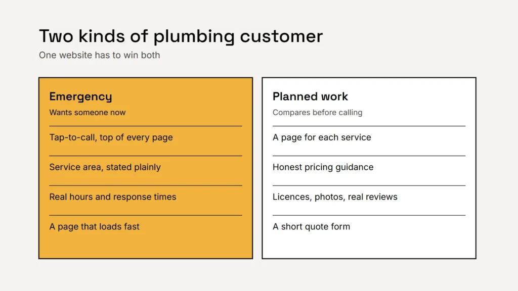
They’re on a phone, probably stressed, and they’ll call the first plumber who looks able to help. In the few seconds they give you, they need to see:
- A phone number they can tap, at the top of every page and again near the bottom.
- Whether you serve their area, in plain words near the top.
- When you can come. State your real hours and response times, including whether you offer out-of-hours service.
- A page that loads fast. Google’s Core Web Vitals suggest the main content should load within 2.5 seconds. See our guide to Core Web Vitals.
Key takeaway
For emergencies, the website’s only job is to get the call. Make the number impossible to miss.
The planned-work customer
Someone replacing a water heater, fixing low water pressure or remodelling a bathroom takes longer to decide. They read, compare and look for reasons to trust you. Give them:
- A page for each main service, such as water heaters, drain cleaning, leak detection, repiping and fixture installation, explaining what’s involved and what happens on the visit. Our guide to service pages shows how.
- Pricing guidance. Call-out fees, starting prices or a clear explanation of how you quote. Whatever you publish must be accurate.
- Proof. Licences and insurance where your state requires them, photos of your team and vans, and real reviews. The FTC’s rule on fake reviews bans fake or bought reviews and testimonials.
- A short quote form, with an optional photo upload so you can see the problem first. Test it every month; see contact forms that work.
A burst pipe needs a phone number. A new water heater needs a reason to trust you. A good plumbing website has both.
Service areas, done right
Copying the same page for every town you cover can break Google’s spam policies on doorway pages. List your service area clearly on one page and in your Google Business Profile, which allows up to 20 service areas, and add a page for a specific town only where you have real work and something genuinely local to say. Our local search guide explains more, and our guide to Google Local Services Ads covers the paid option many plumbers use.
Common mistakes
- A phone number shown as an image, so it can’t be tapped.
- One “Services” page listing everything in a single paragraph.
- Stock photos of plumbers who don’t work for you.
- Out-of-date hours or emergency promises you can’t keep.
- A contact form that quietly stopped working after an update.
Checklist
- Tap-to-call at the top of every page.
- Service area and response times stated plainly.
- A page for each main service.
- Honest pricing guidance.
- Real photos, licences and reviews.
- One clear service-area page, not dozens of copies.
Related service
Plumbing websites built to make the phone ring, with service pages, tracked calls and quote requests that reach you.