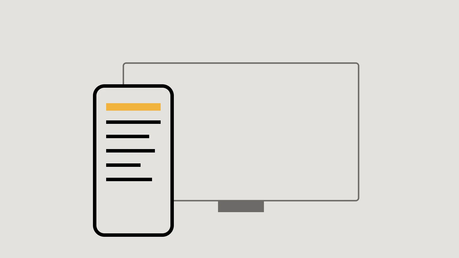
Google explains mobile-first indexing simply: it uses the mobile version of a site’s content, crawled with a smartphone crawler, for indexing and ranking. In October 2023 Google announced that the move to mobile-first indexing was complete. For a small business, the practical question is whether your mobile site shows everything your desktop site does.
Responsive design makes it easy
Google recommends responsive web design, where one page adapts to every screen size, because it is the easiest pattern to implement and maintain. Most modern website platforms and themes are responsive. If yours is an older site with a separate mobile version, or a theme that isn’t mobile-friendly, Google notes you may need a new theme.
Key takeaway
With a responsive site, mobile and desktop share the same content automatically. Most of the checklist then takes care of itself.
Same content, same signals
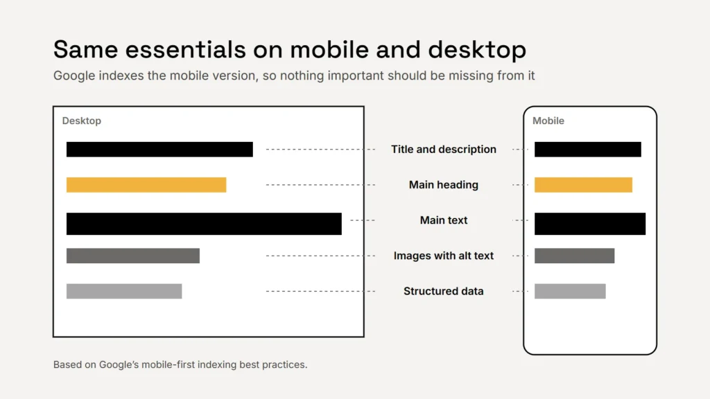
Google’s best practices say the mobile site should have:
- The same content as the desktop site. Text cut from the mobile version to save space is text Google may not see.
- The same clear headings.
- The same structured data, such as your business details. See our guide to structured data.
- Equivalent titles and meta descriptions, and the same robots tags.
- The same images with the same alt text. Our alt text guide explains what to write.
Don’t hide content behind taps
Google says it won’t load content that needs a user interaction, such as swiping, clicking or typing, to appear. Lazy-loading images as people scroll is fine, but primary content shouldn’t only load after a tap.
Let Google see your files
Don’t block the CSS, JavaScript or images Google needs to render your pages in your robots.txt file. Google’s October 2023 announcement named mobile pages blocked by robots.txt, and sites that redirect every mobile page to the home page, among the ways sites fail on mobile.
If a customer can’t see it on their phone, assume Google can’t either.
Usable on a phone
| Check | Why |
|---|---|
A viewport meta tag, width=device-width | Without it, MDN explains, phones may render the page at a desktop-like width |
| Zoom allowed | MDN warns that disabling zoom stops people with low vision from reading |
| Tap targets at least 24 × 24 CSS pixels, or well spaced | WCAG 2.2 Success Criterion 2.5.8, with some exceptions |
| No full-screen pop-ups over content | Google advises against interstitials that obscure the whole page |
| Phone number as a tap-to-call link | Lets mobile visitors call you in one tap |
Pop-ups: use banners instead
Google defines intrusive interstitials as page elements that obstruct the view of content, usually for promotions, and recommends small banners instead for things like newsletter sign-ups. Interstitials that are legally required, such as an age check, are exempt. Keep them as an overlay on the page, rather than redirecting people elsewhere.
How to check your own site
- Use your own phone. Read every important page, tap every button and send a test enquiry.
- Compare with desktop. Is any text, image or section missing on mobile?
- Run Lighthouse in Chrome’s developer tools, which Google describes as a way to find improvements including mobile usability.
- Check Search Console for crawling and indexing problems. Our Search Console guide shows where to look.
Checklist
- A responsive theme.
- The same content, headings, images and alt text on mobile.
- Nothing important hidden behind taps.
- CSS, JavaScript and images not blocked.
- Viewport tag, zoom allowed, tap targets big enough.
- Banners, not full-screen pop-ups.
Speed matters on phones too: see our guide to Core Web Vitals.
Sources
- Google Search Central: Mobile site and mobile-first indexing best practices
- Google Search Central Blog: Mobile-first indexing has landed (31 October 2023)
- Google Search Central: Avoid intrusive interstitials and dialogs
- Google Search Central: Understanding page experience
- MDN Web Docs: Viewport meta tag
- W3C WAI: Understanding Success Criterion 2.5.8 Target Size (Minimum)